Review asset revenue
Read the Asset Revenue report to see how much sales value each machine or workstation earns, ranked by revenue and broken down by job and customer.
Last updated
Asset Revenue is an analytics report that answers one question: how much of your sales value does each piece of equipment earn? In Bulk, an asset is a machine or workstation on the shop floor, such as a laser cutter or a press brake, and a job is one unit of production work that carries a sale value. The report takes the value of your jobs and spreads it across the assets that worked on them, in proportion to the time each asset ran. The result is a revenue figure per asset, a revenue-per-hour rate, and a ranked view of which equipment pulls its weight.
This turns raw run-time into a money view of the floor. Instead of "the laser cutter ran 240 hours last quarter," you get "the laser cutter earned 92,000 pounds last quarter, at 383 pounds per productive hour, and carried 41 percent of the plant's revenue."
When to use Asset Revenue
Use this report when you want to reason about equipment in money terms rather than hours:
- Find the assets that earn the most, and the ones that earn the least per hour they run.
- See how revenue per asset is trending across recent months.
- Understand how concentrated your revenue is, for example whether a handful of machines carry most of it.
- Drill into one asset to see which jobs and which customers drove its revenue.
For a live "what is happening right now" view of the same equipment, use the asset board. For equipment efficiency and downtime over time, use the OEE timeline. Asset Revenue answers "what did this equipment earn," not "is it running now" or "how efficient was it."
Before you start
You need the following for the report to show useful figures:
- The View production permission (
production.view). This permission loads the report. It is granted by default to the Super user, Entity admin, Manager, Operator, Tablet user, Invoicing, Dashboards, and Master data roles. Without it the report cannot read its data. - The Analytics area enabled for your tenant, so the Analytics menu appears.
- Revenue attribution turned on for at least one asset type. Job value is only spread across asset types that have this switch on. If none do, the report has nothing to attribute.
- Jobs that carry a sale value. Only jobs with a value greater than zero are counted. Jobs whose status is cancelled or deleted are always excluded.
- Analytics snapshots refreshed. The report reads from periodic analytics snapshots rather than live tables, so brand-new work appears after the next snapshot runs.
- A site (entity) selected in Bulk. The report always reflects one site at a time.
Asset Revenue is a Beta report
Asset Revenue is marked Beta in the Analytics menu. It is usable and the figures are real, but the report is still being refined, so expect the layout and metrics to keep evolving. Treat its numbers as a management view, not as a system of record for accounting.
Turning on revenue attribution is an asset-type setting, not something you do on this page. See Set up asset types and layouts for that switch.
Open the Asset Revenue report
- Open the Analytics menu.
- Select Asset Revenue. The report opens at
/analytics/asset-revenue.
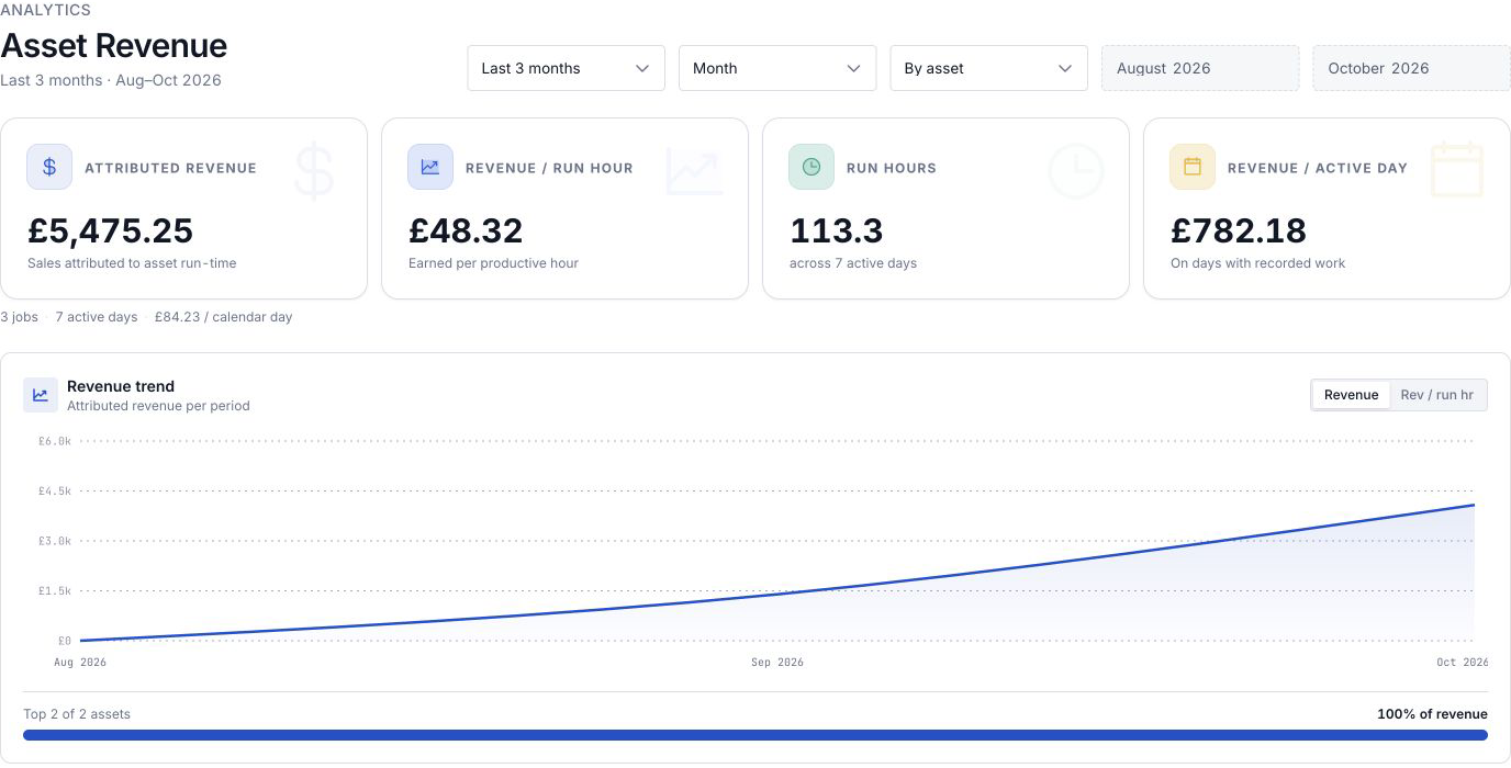
The header shows the eyebrow Analytics, the title Asset Revenue, and a line naming the active range, for example "Last 3 months" followed by the resolved months such as "Aug–Oct 2026". The report opens grouped By asset for the Last 3 months.
Choose the range and grouping
Five controls in the header shape what the report shows. Change any of them and the figures recalculate:
- Range preset — Last 3 months (a rolling three-month window) or Custom range. Choosing Custom range enables the start and end fields.
- Granularity — Month or Day. This sets both the period buckets in the trend chart and the type of the start and end fields (a month picker or a date picker).
- Grouping — By asset (one row per machine or workstation) or By asset type (one row per type, such as all laser cutters together).
- Start and End — the beginning and end of a custom window. These are disabled while the preset is Last 3 months; switch to Custom range to use them.
Revenue-per-hour comparisons in the report always benchmark against a rolling three-month average, regardless of the window you pick, so a short custom range still shows whether an asset is running above or below its recent norm.
Read the headline metrics
Four cards across the top summarise the whole selected range:
- Attributed revenue — the total sale value attributed to asset run-time in this range. The card notes "Sales attributed to asset run-time".
- Revenue / run hour — revenue divided by productive run hours, the money earned per hour equipment actually ran. The card notes "Earned per productive hour".
- Run hours — total productive hours, with a line showing how many active days those hours span.
- Revenue / active day — revenue divided by the number of days that had recorded work, so idle days do not drag the figure down. The card notes "On days with recorded work".
Beneath the cards, a single muted line carries the supporting counts: the number of jobs, the number of active days, and revenue per calendar day. These are the "how much activity" figures, kept out of the way so the money figures lead.
Read the revenue trend and concentration
The Revenue trend chart plots attributed revenue for each period (month or day) across the range. A toggle in its header switches the line between two measures:
- Revenue — total attributed revenue per period.
- Rev / run hr — revenue per run hour per period, which strips out how busy the period was so you can see whether the rate is rising or falling.
Below the chart, a concentration strip shows how top-heavy your revenue is. It reads something like "Top 3 of 12 assets" on the left and the share of revenue those top assets earned on the right, with a bar splitting the top assets from everyone else. This is a quick read on risk: if three machines out of twelve earn 80 percent of revenue, a stoppage on any of them matters a lot.
If the range has no attributed revenue, the chart area reads "No revenue recorded in this period." instead of a line.
Rank assets on the leaderboard
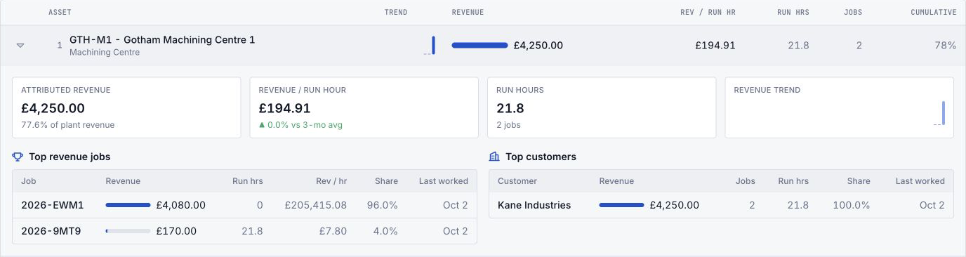
The leaderboard lists assets (or asset types, if you grouped that way) ranked from highest revenue to lowest. Each row carries, from left to right:
- A rank number and the asset name, with its asset type beneath (or, when grouped by type, the count of assets in that type).
- Trend — a small sparkline of the asset's revenue across the periods.
- Revenue — the attributed revenue, paired with an in-row bar sized against the top earner.
- Rev / run hr — revenue per run hour, with a small up or down badge when it differs from the asset's three-month average by more than a rounding margin.
- Run hrs and Jobs — the productive hours and the number of jobs behind the figure.
- Cumulative — a running percentage of total revenue as you read down the list, so you can see how far down the ranking you go to reach, say, 80 percent of revenue.

Drill into one asset
Select any leaderboard row to expand it. The expanded panel shows a per-asset breakdown:
- A scorecard of four tiles: attributed revenue with its share of plant revenue; revenue per run hour with an up or down comparison against the asset's three-month average (or "No 3-month benchmark" when there is not enough history); run hours with the job count; and a revenue sparkline.
- Top revenue jobs — a table of the jobs that earned the most on this asset, each with its revenue, run hours, revenue per hour, share of the asset's revenue, and the date it was last worked.
- Top customers — the same view rolled up by customer, so you can see which customers this asset earns from. Work with no customer attached is grouped under "No customer".
If the asset has no attributed jobs or no customer revenue in the range, each table shows a short "No attributed jobs for this asset in the selected range." or "No customer revenue for this asset in the selected range." message instead.
How revenue is attributed
Understanding the split keeps the figures honest:
- Bulk starts from each job's payable value, including assigned order services when they form part of the sale total.
- It looks at every production timer entry on that job and keeps only the time spent on asset types that have revenue attribution turned on.
- It splits the job's value across those assets in proportion to their run-time. If a job ran six hours on a laser cutter and two hours on a press brake, the laser cutter is credited with three-quarters of the value and the press brake with one-quarter.
- Time spent on asset types without revenue attribution is ignored entirely. It neither earns value nor dilutes the split, so a job that also spent an hour on a non-attributing packing bench still splits its full value between the laser cutter and the press brake.
Because attribution follows run-time, an asset only earns revenue for the hours it actually ran on valued jobs. Revenue is dated by the job's invoice date where available, then its delivery, receipt, or creation date, which is also the date used when converting between currencies.
Example: Gotham Applied Sciences
Bruce opens the Gotham Applied Sciences report for Last 3 months, grouped By asset. The report shows £5,475.25 attributed revenue across 113.3 run hours, three jobs and seven active days.
GTH-M1, Gotham Machining Centre 1, leads with £4,250.00 and a £194.91 revenue-per-hour rate. GTH-M2 follows with £1,225.25 and £13.39 per hour. The cumulative column reaches 78 percent after the first asset and 100 percent after the second.
Expanding GTH-M1 shows 77.6 percent of plant revenue, its two jobs, and Kane Industries as its customer. The benchmark comparison is 0.0 percent for this range, so the leaderboard does not show a change badge. A very short recorded job can display 0 rounded hours and a high rate; read the underlying time before comparing equipment.
Expected result
You have a money view of your equipment for the selected range: a headline total and rate, a trend of how revenue and rate move over time, a ranked leaderboard of which assets earn most, and a per-asset drilldown into the jobs and customers behind each figure.
Limitations and availability
- Asset Revenue is a Beta report. It is functional and its figures are real, but the layout and metrics are still being refined. It is a management view, not an accounting source of record.
- The report is read-only. You review figures here. Turning revenue attribution on or off is an asset-type setting; giving jobs a sale value happens in Production.
- Only revenue-attributing asset types earn. If no asset type has revenue attribution turned on, the report shows "No revenue asset types enabled" and attributes nothing. Support equipment you leave off never appears as an earner.
- It reads from analytics snapshots. Figures reflect the last snapshot, not the live second-by-second state, so very recent work may not appear until the next snapshot runs. A "This report is still calculating from analytics snapshots." note can show briefly while a snapshot is in progress.
- Cancelled and deleted jobs are excluded, as are jobs with no sale value. Only valued, active jobs contribute revenue.
- Currency conversion can be incomplete. When jobs are priced in more than one currency and an exchange rate is missing for the value date, the report warns that some revenue could not be converted and totals may be incomplete.
- The report reflects one site at a time. Switch the selected site to see a different plant.
Troubleshooting
- "No revenue asset types enabled." No asset type has revenue attribution turned on. Open an asset type, go to its Operational tab, and turn on Revenue attribution. See Set up asset types and layouts.
- "No eligible timer history." The range has no timer work on revenue-attributing asset types. Widen the range, or confirm operators ran timers on those assets for valued jobs. See Run production timers.
- "Analytics snapshots are not ready." The report's snapshot data has not been built yet. Wait for the next analytics snapshot to run, then reload the report.
- "Asset revenue could not load." The report hit an error loading its data. Confirm your role includes the View production permission, then select Retry.
- A totals warning about missing exchange rates. Some revenue is priced in a currency with no exchange rate for its value date. Add the missing rates so those allocations convert. See Manage currencies and exchange rates.
- An asset you expect is missing or earns nothing. Its asset type may not have revenue attribution turned on, or its jobs may carry no sale value, be cancelled, or fall outside the range.
Revenue allocations use each job's payable value, including assigned order services when those are part of the sale total.
Related guidance
- Set up asset types and layouts — turn on Revenue attribution for the asset types that should earn.
- Run production timers — the run-time that drives attribution.
- Orders and jobs — where a job's sale value comes from.
- Manage currencies and exchange rates — the rates behind currency conversion.
- Use the asset board — the live status view of the same equipment.
- Review OEE timelines — equipment efficiency and downtime over time.
- Analytics — the full set of analytics views.
Review 5S analytics
Read the 5S Audits Overview dashboard to track workplace-organization scores, pillar performance, and area or asset breakdowns for one site.
Review OEE timelines
Read the OEE Timeline to see how each asset or operator spent its time, categorise downtime, and correct mislabelled records within the last 48 hours.