Review downtime Pareto
Read the Downtime Pareto dashboard to rank stoppage reasons by lost time, find the vital few losses, and drill from a reason or machine down to individual downtime events.
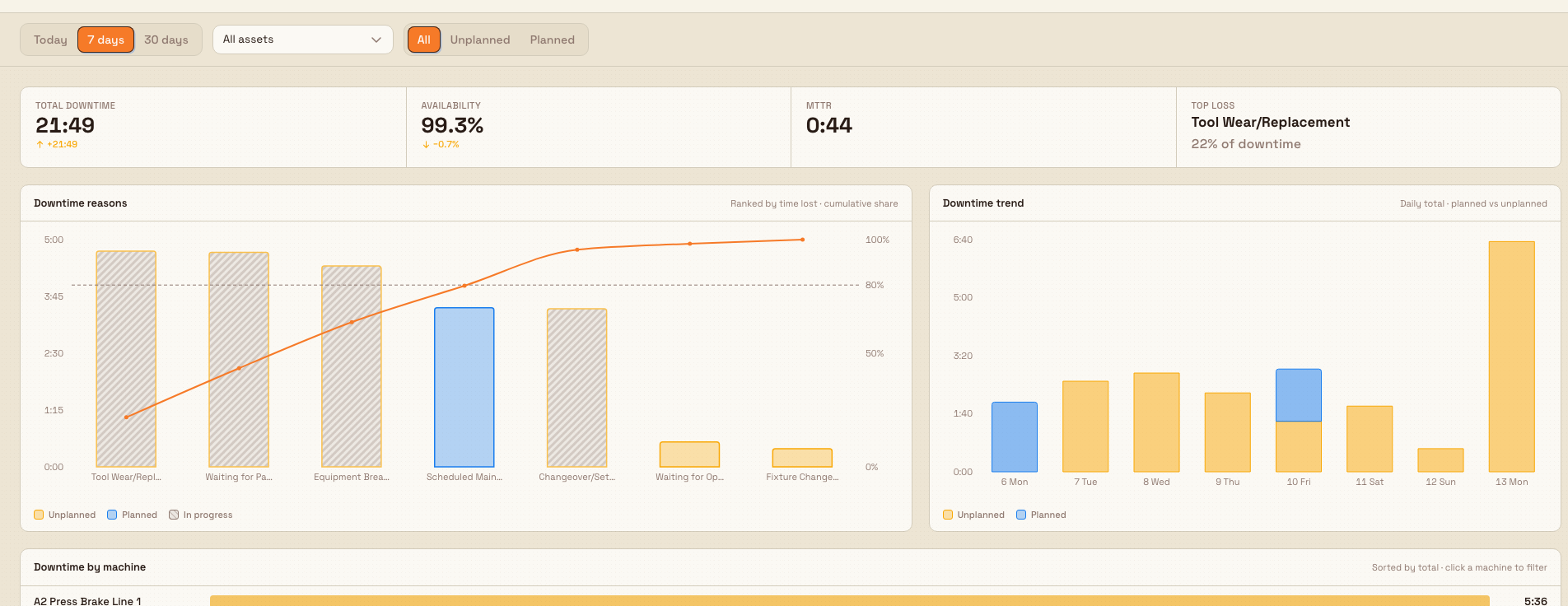
The Downtime · Pareto dashboard answers one question: where did the hours go? It ranks every downtime reason by the total time lost across your machines, so you can see the small number of causes responsible for most of your stoppages and act on them first. Downtime is any period a machine was stopped instead of producing. A Pareto is a chart that sorts those causes from largest to smallest and draws a running cumulative line on top, so the "vital few" reasons that make up most of the loss stand out from the "trivial many".
Use this dashboard when you are planning maintenance, running a continuous-improvement review, or preparing for a shift huddle and need a defensible, ranked list of what to fix. Every number is calculated on the server for the exact time range, machine, and reason you have in view, and the whole page is cross-filterable: click a reason or a machine and the entire dashboard narrows to it. Because the scope lives in the page address, a view you build is shareable — send the link and a colleague sees the same filtered picture.
dashboards.downtime-pareto-01
Before you start
You need a few things in place for this dashboard to show real numbers:
- Permission to view production data. The dashboard is gated by the
production_jobs.viewpermission — the same permission the other OEE views use. OEE stands for Overall Equipment Effectiveness, Bulk's measure of how much of a machine's available time turned into good output. The built-in Super user, Entity admin, Operator, Tablet user, and Invoicing roles include this permission. Without it, the dashboard cannot load its data. - OEE downtime tracking enabled on at least one asset type. An asset type is the template that defines a class of machine (for example "CNC press"). Downtime tracking is switched on per asset type. If no asset type has it enabled, the page shows "No downtime tracking configured" instead of a chart.
- Downtime reasons configured. Each reason (for example "Tool change" or "Material wait") carries an OEE loss category and a planned-or-unplanned setting. Reasons set to the planned-stop loss type count as Planned downtime; everything else counts as Unplanned. Events recorded without a reason are grouped as Uncategorized.
- Recorded downtime events. The rankings are built from actual downtime events logged against your assets. With tracking on but no events in the window, the dashboard shows a "No downtime this period" state.
Where downtime data comes from
The dashboard does not create downtime data — it visualizes it. Reasons and their categories are set up in Settings, and downtime events are captured as your machines run. If the rankings look thin, confirm tracking is enabled and reasons are being applied at the source.
Open the dashboard
- Open the Dashboards area. The picker page ("Select Dashboard") lists every board as a card under Standard suite.
- Find the Downtime · Pareto card (code
DASH-DT, marked with a wrench icon). Double-click it to open the dashboard directly. - Alternatively, single-click the card to select it, then use View DASH-DT in the confirmation bar, or Open in new window to open it in a separate tab.
- The dashboard opens full-width with no sidebar. Use the back control (labelled Back to dashboards) in the top-right to return to the picker.
Set the scope
A sticky scope bar sits at the top of the dashboard. Every control here filters the whole page, and each choice is written into the page address so the view is shareable and the browser back and forward buttons work.
- Time range. A segmented control offers Today, 7 days, and 30 days. The dashboard opens on 7 days by default.
- Asset. A single-select list defaults to All assets. Pick one machine to focus the entire dashboard on it; each option reads as the asset code followed by its name.
- Type. A segmented control offers All, Unplanned, and Planned, so you can isolate unplanned breakdowns from planned stops like scheduled maintenance.
- Reset. When any non-default filter is active, a Reset button appears to clear them all at once.
Active filters also show as removable chips beneath the controls — for example Asset · ..., Type · Unplanned, or Reason · Tool change. Select the small remove control on a chip to drop just that facet.
Read the metrics
The hero row sits directly under the scope bar and totals the whole view in four cells:
- Total downtime — the summed stopped time across the scope, shown as hours and minutes.
- Availability — the share of available time the in-scope machines spent running rather than stopped, as a percentage.
- MTTR — mean time to repair, the average length of a downtime event. A rising MTTR means stoppages are taking longer to clear.
- Top loss — the single biggest reason by time, with its share of total downtime.
Where the data allows, each metric carries a small change indicator comparing it against the immediately prior, equal-length window (for example the previous 7 days). The arrow follows the direction of the change and the colour signals whether that movement is good or bad, so a fall in availability reads as a warning even though the number went down. A metric shows a dash when it cannot be calculated for the current scope.
Read the charts
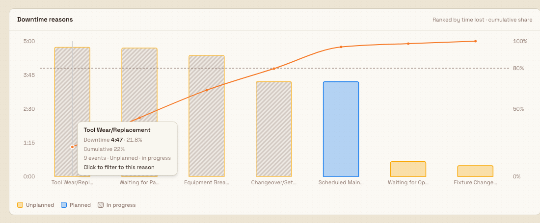
Downtime reasons is the true Pareto, headed "Ranked by time lost · cumulative share":
- Bars are sorted strictly from most to least time lost. A cumulative-percentage line climbs left to right, and a dashed reference line marks the 80% mark — the classic cutoff for the vital few.
- Colour encodes type: Unplanned, Planned, and a neutral Other / Uncategorized. An in-progress (still open) stoppage is drawn with a moving striped fill. A colour legend under the chart names every series in view, so you never rely on colour alone.
- Only the top reasons get their own bar; the long tail is folded into a single
Otherbar, and events with no reason collect in an Uncategorized bar. Neither is ever dropped, so the totals always add up. - Hover any bar for a tooltip with its downtime, share, cumulative percent, event count, and type. Click a named reason bar to cross-filter the entire dashboard to that reason; click it again to clear the filter.
Downtime trend, headed "Daily total · planned vs unplanned", stacks one bar per day across the window, split into planned and unplanned time. It answers "are we improving?" next to the Pareto's "what is the top loss right now?". Hover a day for its total, unplanned, and planned figures.
dashboards.downtime-pareto-02
Compare machines and drill into events
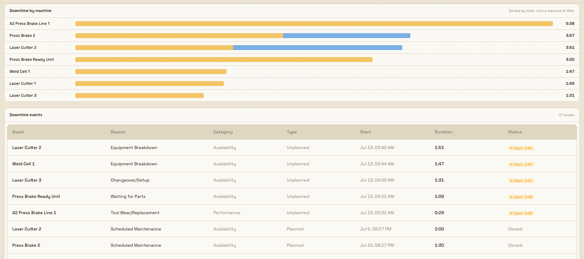
Downtime by machine, headed "Sorted by total · click a machine to filter", draws one horizontal bar per asset, split planned versus unplanned and sorted by total downtime. Bar length is proportional to the busiest machine, so the worst offenders are obvious. Click a machine row to scope the whole dashboard to it; the folded Other row is not clickable.
Downtime events is the drill at the bottom, a bounded table of the individual stoppages behind everything above. Its subtitle shows how many rows are shown and whether more are available. The columns are:
- Asset — the machine that stopped.
- Reason — the downtime reason applied.
- Category — the OEE loss category.
- Type — Planned or Unplanned.
- Start — when the stoppage began.
- Duration — how long it lasted.
- Status — a live Open badge with a running elapsed time for stoppages still in progress, or Closed for finished ones.
Open events float to the top, then rows sort by longest duration first. The Open badge keeps counting up on its own, so an incident that is still live stays visible and current.
dashboards.downtime-pareto-03
Granite Peak Manufacturing example
A continuous-improvement lead at Granite Peak Manufacturing's Leeds Fabrication Plant runs a Monday review. They open Dashboards, double-click Downtime · Pareto, and leave the window on 7 days, All assets, All types.
The hero row reads: Total downtime 46h 20m, Availability 88.4% (down from the prior week), MTTR 41m, and Top loss "Tool change" at 34% of downtime. In the Downtime reasons Pareto, tool change, material wait, and setup together cross the dashed 80% line — three reasons account for most of the week's loss. The lead clicks the Tool change bar; the whole page narrows and a Reason · Tool change chip appears. In Downtime by machine, the loss is concentrated on one press, so they click that machine to filter further, then read the Downtime events table: a dozen closed tool-change stoppages of 20 to 45 minutes, clustered on the early shift. That is a concrete, timestamped case for moving tool changes off-line, ready for the maintenance huddle. Before leaving, they copy the page link so the maintenance planner opens the exact same filtered view.
What you can expect
For any window, machine, type, and reason you choose, the dashboard returns a truthful, ranked picture of lost time: totalled headline metrics, a strict Pareto with a cumulative line, a daily planned-versus-unplanned trend, a per-machine comparison, and the underlying events. Every filter recomputes the whole page, and open incidents keep counting in real time.
Limitations and feature state
- This dashboard is available (generally released), not a beta.
- It is read-only. It visualizes downtime data but does not let you create or edit downtime events, reasons, or timers from here — corrections are made where the data originates.
- Rankings depend on setup: OEE downtime tracking must be enabled on an asset type, reasons must be configured, and events must be recorded. Missing any of these shows an empty or "no downtime" state rather than a chart.
- Every figure reflects the current scope. Changing the window, machine, type, or reason recomputes all metrics and charts — the totals are meant to move with your filters.
- Availability is derived from availability-category downtime measured against the window and the number of in-scope machines. It is a downtime-based availability figure, not a full OEE score.
- Over very large windows the dashboard reads a bounded number of events. If that limit is reached, a "Showing partial data" banner appears and the oldest events may be omitted; narrow the time range or pick a single machine for exact figures.
Troubleshooting
- "No downtime tracking configured." No asset type has OEE downtime tracking enabled, so there is nothing to rank. Enable tracking on the relevant asset type in settings, then return to the dashboard.
- "No downtime this period." Tracking is on and no filters are active, but no downtime was recorded in the window — a good result. Widen the time range to confirm, or check that reasons are being applied when stoppages happen.
- "No events match." Your filters exclude everything. Use Reset filters in the empty state, or remove a chip in the scope bar.
- A "Showing partial data" banner appears. The window exceeded the read limit. Narrow the time range or scope to a single machine for exact totals.
- The dashboard will not load at all. Your account most likely lacks the
production_jobs.viewpermission. Ask an administrator to grant a role that includes it.
Related guidance
- Review OEE assets — a per-machine timeline of running and downtime, complementary to this ranking.
- Review OEE people — the same lens applied to operators instead of machines.
- Review OEE timelines — the analytics home for the OEE asset and user timelines.
- Configure downtime reasons — define the reasons, categories, and planned settings that drive every bar here.
- Configure OEE dashboards — set up and manage OEE dashboards.
- Run production timers — how running and stopped time is captured on the shop floor.
- Dashboards — the full dashboard picker.
Review parts performance
Read the Parts Performance dashboard to rank every part by output volume, first-pass yield, scrap, and movement over a chosen window, then drill into one part's weekly yield, top defects, and recent jobs.
Teamboards
Run a plant's daily SQDCP visual-management board — safety, quality, delivery, cost, and people indicators, live widgets, and daily reports — on a shop-floor screen.