Review OEE people
Read the OEE People dashboard to see each operator's running, downtime, and inactive time, per-person OEE, and output across a chosen day.
The OEE People dashboard is a timeline view that shows what each operator was doing over a day — when they were running production, when they were stopped, and how much inactive time sat between. OEE stands for Overall Equipment Effectiveness: a single percentage that combines whether work was running (availability), how fast it ran (performance), and how much of the output passed quality. The People view applies that lens to your workforce instead of your machines, so a supervisor can see productivity and stoppages person by person.
Use it at the end of a shift, during a stand-up, or when investigating a drop in output. Because each row is a person and each colored block is a real event, you can spot who lost time, when, and to which category of loss — then click straight through to the details.
Before you start
You need two things in place:
- Permission to view OEE. The dashboard reads the
analytics.view_oeepermission. The built-in Super user, Entity admin, Manager, and Dashboards roles all include it. Without it, the timeline cannot load its data. - At least one User OEE dashboard configured. A User OEE dashboard is a saved list of the operators you want to watch together (for example, one shift or one cell). If none exists, the page shows an empty state instead of a timeline. Creating or editing dashboards needs the
analytics.manage_oee_dashboardspermission, held by the Super user, Entity admin, and Manager roles.
The running, downtime, and output figures come from production activity: time an operator booked against a production timer counts as running, a logged stoppage counts as downtime under its reason category, and the units they recorded feed the output column. If your operators do not use timers or log stoppages, rows will show mostly inactive time.
No dashboard yet?
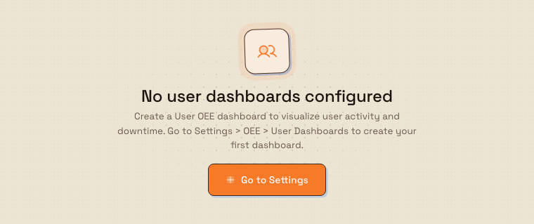
If you open OEE People and see "No user dashboards configured", use the Go to Settings button. It takes you to Settings, OEE, User Dashboards, where you can add your first one.
dashboards.oee-people-03
Open the dashboard
- Open the Dashboards area. The picker page ("Select Dashboard") lists every board as a card.
- Find the OEE / People card and select it. The dashboard opens full-width with no sidebar.
- Use the back arrow (labelled Back to dashboards) in the top-right to return to the picker.
You can deep-link to a specific saved dashboard by adding the query parameter ?dashboard= followed by the dashboard's ID to the page address.
dashboards.oee-people-01
Read the timeline
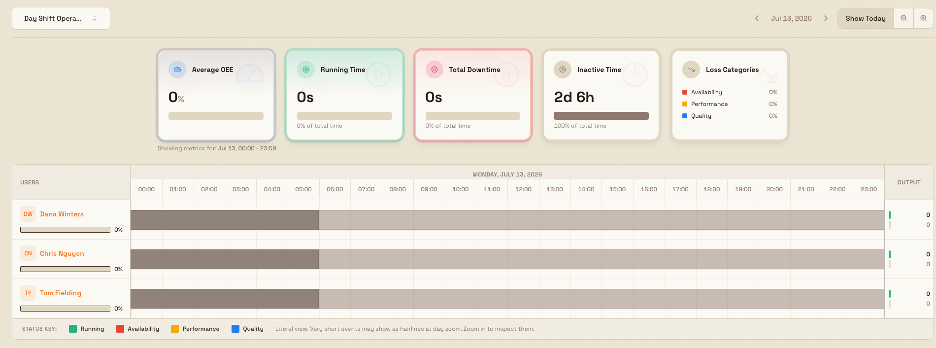
Choose what you are looking at. The nav bar at the top holds the controls:
- A dashboard selector (showing the current board name, with a star marking the default) lets you switch between saved User OEE dashboards. Type in Search dashboards... to filter.
- Previous day and Next day arrows and a date picker move the day in view; Show Today jumps back to the current day.
- Zoom in and Zoom out change the window from as wide as seven days to as narrow as one hour.
Read the summary cards. Above the timeline, a row of cards totals the whole board for the visible time range:
- Average OEE — the average score across the operators shown.
- Running person-time, Downtime person-time, and Inactive person-time — total time in each state, each with its share of total time.
- Loss Categories — how downtime splits across Availability, Performance, and Quality.
A line beneath reads "Person-time is summed across all displayed users", and a footer shows the exact range the metrics cover.
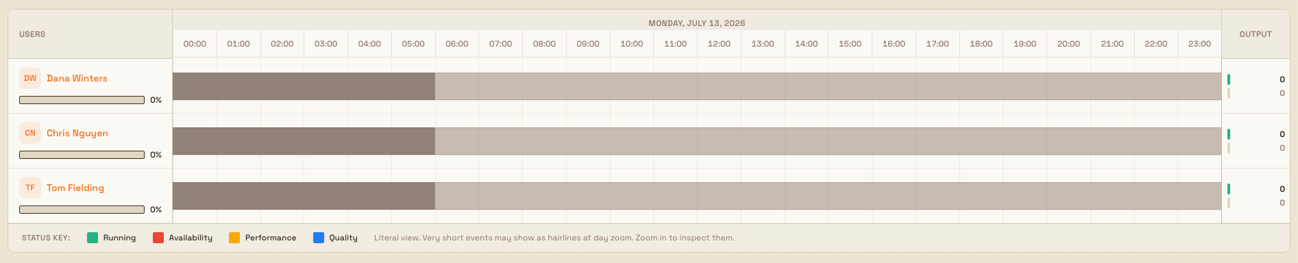
Read each operator's row. In the timeline itself:
- The left Users column shows each operator's initials, name, and a color-coded OEE % bar. The bar turns green at 85% or above, blue from 70%, amber from 50%, and red below 50%.
- The main track is a literal, minute-by-minute strip. Green means running; red, amber, and blue blocks are downtime colored by loss category (Availability, Performance, Quality); a hatched gray block means unknown coverage; plain gaps are inactive.
- The right Output column shows produced versus quality quantities for that operator over the window.
- The Status Key legend under the timeline names each color. Very short events can appear as hairlines at day zoom — zoom in to inspect them.
dashboards.oee-people-02
Drill into detail. The rows are interactive:
- Select an operator's name to open that person's record, focused on their production activity.
- Select a running segment to open a detail panel for that period of work.
- Hover any segment to see a tooltip with its duration and, for downtime, its reason.
Granite Peak example
A shift supervisor at Granite Peak Manufacturing's Leeds Fabrication Plant keeps a Day Shift Operators dashboard listing the six people on the morning press line. At 14:00 they open OEE People to review the shift.
The summary cards read: Average OEE 74%, running person-time well ahead of downtime, and Loss Categories weighted toward Availability. Scanning the rows, most operators are solid green with OEE bars in blue and green. One row — Tom Fielding — shows a wide red block from roughly 09:40 to 10:25 and an OEE bar in amber. Hovering the block shows the reason: a material wait. The supervisor selects the block to read the stoppage detail, then selects Tom's name to open his record and check the jobs he was on. Tom's Output column confirms the lost time cost about 40 units against plan. The supervisor now has a concrete, timestamped example to raise about morning material staging — without guessing.
What you can expect
For any day and any saved dashboard, OEE People gives you a truthful, per-person picture of running time, stoppages by category, inactive time, output, and an OEE score, all filtered to the exact window you have in view. Switching the date or zoom recomputes every summary card and OEE bar for the new range.
Limitations and feature state
- This dashboard is available (generally released), not a beta.
- It is read-only: it visualizes production data but does not let you edit timers or stoppages from here. Corrections are made where the data originates.
- Rows exist only for operators added to the selected User OEE dashboard. People not on any dashboard do not appear until someone adds them.
- Figures depend on operators using production timers and logging stoppages. Time with neither shows as inactive, and output counts come from the units each operator records.
- Metrics always reflect the visible time range. Zooming or paging changes the totals, which is expected.
Troubleshooting
- "No user dashboards configured." No User OEE dashboard exists for this plant yet. Select Go to Settings (Settings, OEE, User Dashboards) and add one, choosing at least one operator.
- An operator is missing. They are not on the selected dashboard. Switch dashboards using the selector, or edit the dashboard to include them.
- A row is all inactive. That operator booked no timer time and logged no stoppage in the window. Confirm they are using production timers, and check you are viewing the right day.
- The timeline will not load. If a refresh banner appears, use its retry action. A persistent failure usually means your account lacks the view permission — ask an administrator to grant an OEE-viewing role.
Related guidance
- Review OEE assets — the same timeline for machines instead of people.
- Review OEE timelines — the analytics home for the asset and user timelines.
- Review downtime Pareto — rank stoppage reasons by lost time.
- Run production timers — how operators generate the running time this dashboard reads.
- Configure OEE dashboards — set up and manage OEE dashboards.
- Configure downtime reasons — define the reason categories behind each downtime color.
- Review an employee record — where an operator's name links to.
- Dashboards — the full dashboard picker.
Dashboards
Open Bulk's built-in, always-live analytics dashboards for a site from the standalone Dashboards picker, and choose the right board by name, code, or live signal.
Review OEE assets
Read the OEE Assets dashboard to see each machine's running, downtime, and inactive time, per-asset OEE, attached-sensor activity, and output for a chosen day — and correct recent entries when you have edit rights.